Aug 6, 2026Buying Guides
Pantone Color Printing for Custom Packaging: A Complete Guide for B2B Buyers
Learn how Pantone color printing works for custom packaging boxes. Compare Pantone vs CMYK printing, extra costs & tips to get consistent, accurate brand colors on your boxes.
Pantone Color Printing for Custom Packaging: What Brands Need to Know
For many brands, packaging is more than product protection — it is a core part of brand identity. Box colors directly shape how customers recognise and remember your brand.When ordering custom packaging boxes, many brands require exact brand colours to match logos, product identities and existing marketing assets. In these scenarios, Pantone colour printing is often the preferred solution.This guide breaks down what Pantone printing is, when brands should use it, and key points B2B packaging buyers need to evaluate before placing an order.
What Is Pantone Color Printing?
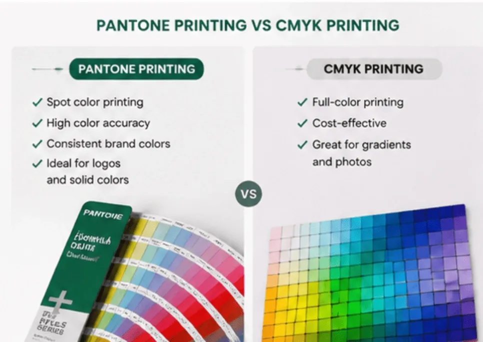
Pantone printing leverages the Pantone Matching System (PMS), a standardised colour system built to deliver consistent colour results across different printing jobs.Traditional CMYK printing creates colours by mixing four base inks:
- Cyan
- Magenta
- Yellow
- Black
Pantone printing, by contrast, uses pre‑mixed, dedicated spot inks assigned to unique Pantone reference codes.Common examples include:
- Pantone 186 C (bright red)
- Pantone 286 C (deep blue)
- Pantone 3435 C (dark green)
Every Pantone shade carries its own unique number, enabling clear, precise colour communication between brands and printing suppliers.
Pantone Printing vs CMYK Printing for Packaging
Your design requirements will determine whether Pantone, CMYK or a hybrid approach works best.表格
Printing Method | Advantages | Suitable For |
|---|---|---|
CMYK Printing | Cost‑effective, supports full‑colour imagery | Product photos, complex artwork, colour gradients |
Pantone Printing | Superior brand colour accuracy | Logos, solid‑colour layouts, premium packaging |
CMYK + Pantone | Combines photographic imagery with precise brand spot colours | High‑end custom packaging |
For instance, a skincare brand may run CMYK for product photography, while applying Pantone spot colour for its logo to preserve brand consistency across all packaging runs.
Why Do Brands Choose Pantone Colors for Packaging?
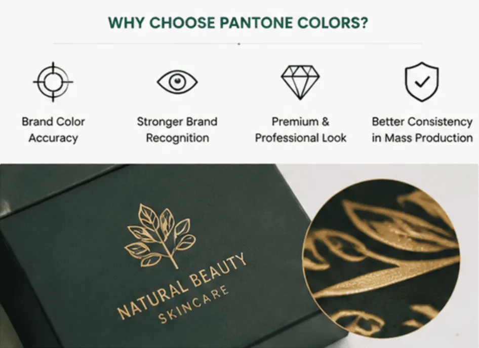
1. Reliable Brand Color Accuracy
Well‑established brands own signature colours that customers recognise instantly. Even minor colour drift on packaging can make new batches look disjointed from older products and marketing materials.Pantone printing helps you maintain:
- Consistent logo colour across batches
- Strong brand recognition
- A polished, professional market appearance
2. Better Reproduction for Tricky Shades
Certain hues are hard to replicate using only CMYK, including:
- Vibrant oranges
- Metallic tones
- Deep navy blues
- Rich specialty greens
- Corporate brand signature colours
Specially formulated Pantone inks deliver far more predictable outcomes for these colours.
3. Elevated Premium Packaging Look
Luxury packaging frequently pairs Pantone spot colours with value‑adding finishing options:
- Gold foil stamping
- Embossing
- Spot UV
- Matte lamination
- Soft‑touch coating
These combinations elevate packaging for categories such as cosmetics, jewellery, luxury gifts and premium food goods.
Does Pantone Printing Cost More?
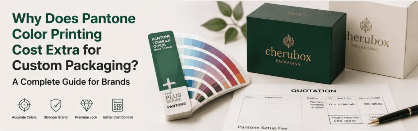
Yes. Pantone printing normally incurs extra setup expenses because each individual Pantone spot colour requires separate ink preparation and press configuration.Total additional costs are driven by several variables:
- Number of Pantone spot colours used
- Size of the printed area
- Total order quantity
- Printing press setup requirements
General cost reference:
- 1 Pantone colour → lower incremental setup cost
- 3 Pantone colours → noticeably higher setup charges
- More than 4 Pantone spot colours often becomes less cost‑effective than switching to CMYK
For custom packaging orders, most suppliers apply separate setup fees for Pantone spot colours.
Note: Pantone adds higher relative cost for short‑run projects. On large‑volume bulk orders, one‑time setup costs are spread over many units, bringing down the per‑box premium.
How Many Pantone Colors Should Be Used on Packaging?
For most custom paper packaging projects, we recommend limiting designs to 1‑3 Pantone spot colours.Key benefits:
- Keeps printing costs under control
- Simplifies colour management during production
- Creates clean, sophisticated visual output
Many successful premium packaging layouts follow this simple formula:
- One primary brand Pantone colour
- One secondary accent colour
- Black or white design elements
A restrained colour palette often delivers stronger luxury appeal.
How to Avoid Pantone Color Differences in Mass Production?
Even with Pantone spot inks, minor colour shifts can occur. Root causes include paper stock, surface coating, press conditions and ambient viewing lighting.Use these practices to achieve stable, predictable colour results:
1. Confirm the full Pantone code
Always provide the complete Pantone reference, for example: Pantone 123 C.Avoid vague verbal descriptions such as “dark green”, “warm yellow” or “royal blue”.
Critical tip: Clearly specify C for coated/gloss paper or U for uncoated / kraft / textured paper. The identical Pantone number will produce visibly different results on coated versus uncoated substrates.
2. Approve physical samples
Digital screens cannot accurately represent final printed output.Prior to full mass production, brands must review and sign‑off on physical colour proofs and pre‑production samples.
3. Account for your paper material
The same Pantone ink will render differently across:
- Coated paper
- Kraft paper
- Textured specialty stock
- Matte‑laminated board
Always evaluate colour performance on your actual selected packaging substrate.
Should You Use Pantone Printing for Your Custom Packaging?

✅ Go with Pantone printing if:
- Exact logo colour matching is non‑negotiable
- Cross‑batch brand consistency is high priority
- You are building premium‑grade packaging
- Your design features clean solid‑colour blocks
✅ CMYK printing is a better fit if:
- Your artwork includes product photographs
- You need full‑colour complex graphics
- Overall cost efficiency is your main focus
For numerous B2B packaging projects, the optimal solution is hybrid:
CMYK printing + selected Pantone spot colour + premium surface finishing
Conclusion: Choosing the Right Color Printing Method for Packaging
Pantone colour printing is a powerful solution for brands demanding precise, repeatable colour across custom packaging runs.By selecting the correct printing workflow, supplying complete Pantone references and approving physical pre‑production samples, you can deliver professional packaging that strengthens your brand presence in‑market.As your trusted custom packaging supplier, Cherubox Packaging supports brands, wholesalers and distributors with precise Pantone colour matching and premium finishing for box projects. Reach out to info@cherubox.com to talk through your packaging colour requirements.